Common sense
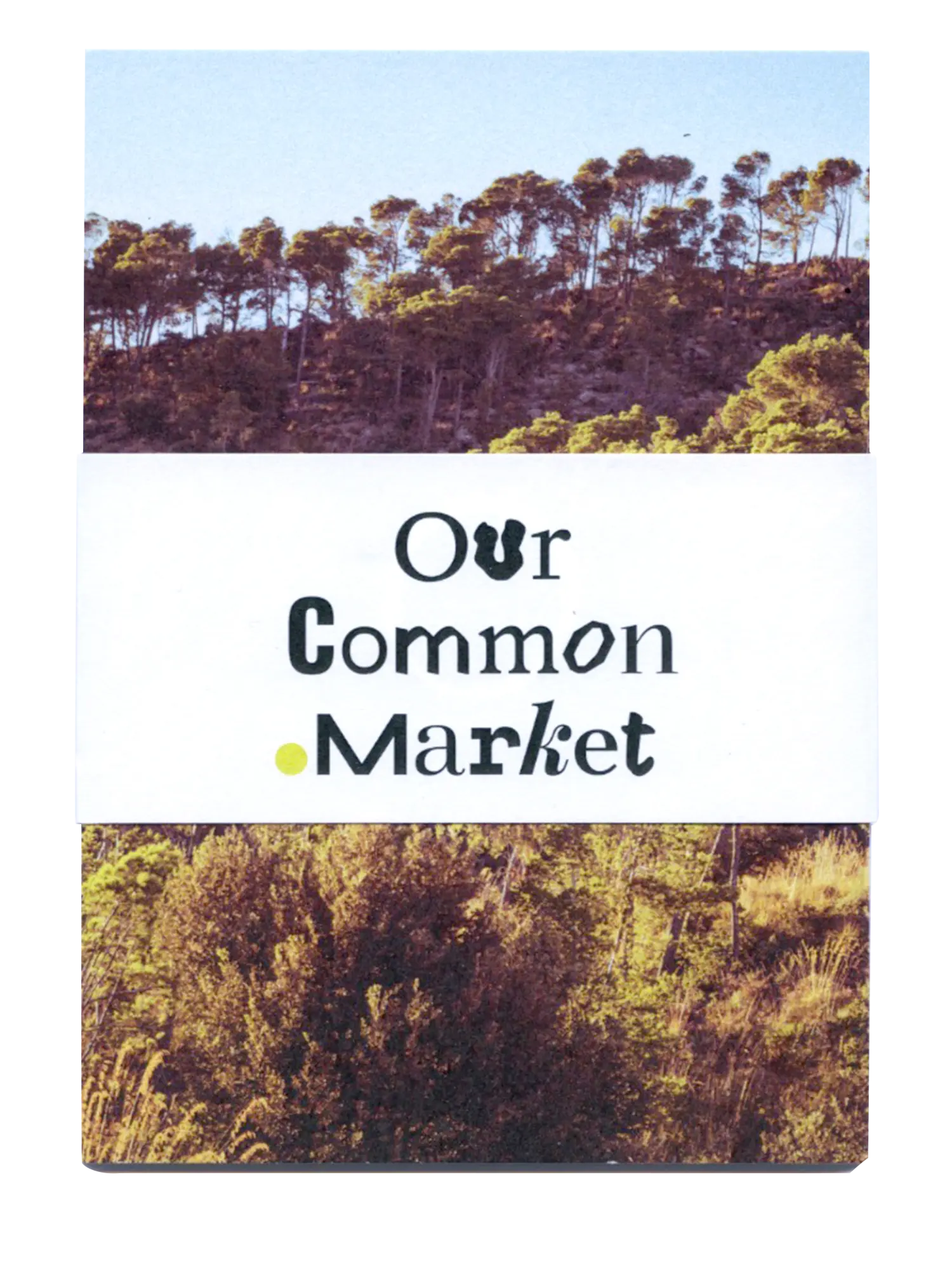
Visual identity for OurCommon.Market – a gathering space for diverse, community-centred fashion, clothing and textile projects to connect and bring visibility to commons-based fashion systems worldwide.
With/for: OurCommon.Market (2024)


The idea of the traditional marketplace was central to the development of the identity. A teeming, diverse place to assemble and exchange not just goods but also knowledge and experiences. The logotype is made up of 15 different open source typefaces to communicate diversity and the pluriverse. The dot is oversized to emphasise that the logotype spells out the url but also – and more importantly to symbolise our planet – the ultimate common.
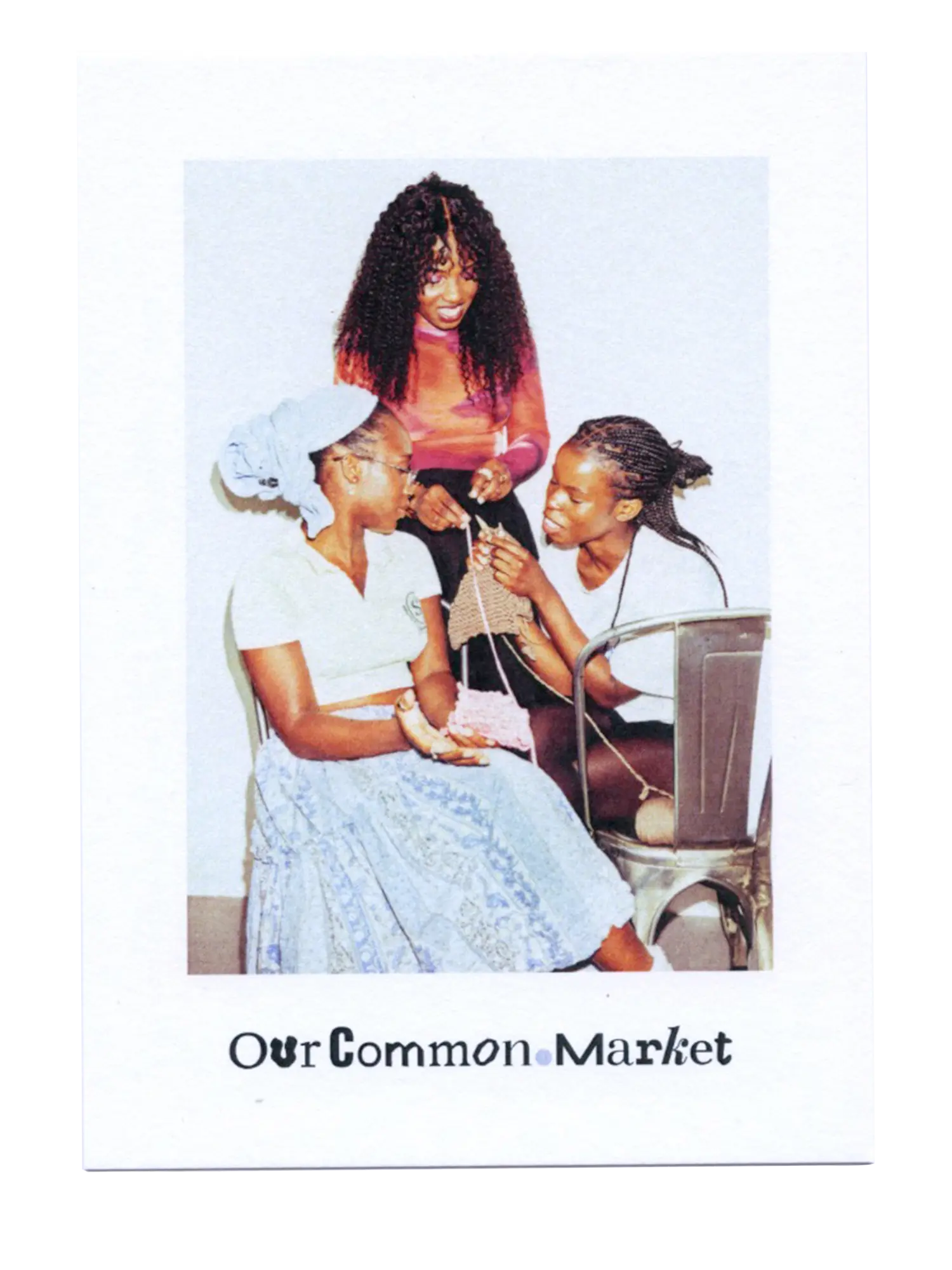
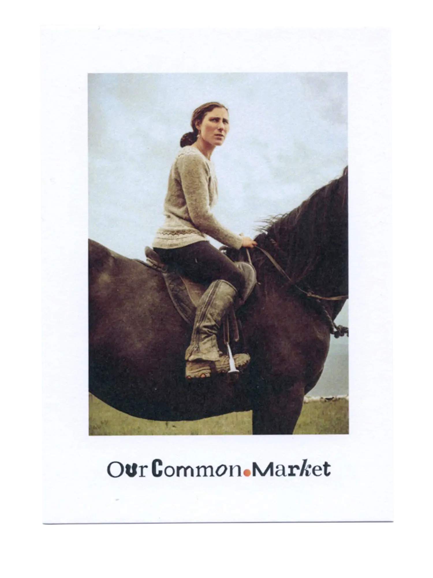


We created a social media strategy with content pillars and corresponding designs and templates for OC.M to use continiously.

